NAE Graph In-Depth Look
Time-Series Graph Overview
An NAE Agent displays a visualization of monitored data in a graph that plots values against time. This graph connects the values of the monitored resources sampled regularly to show changes over time. These values are mapped every 5 seconds straight from the Time-Series Database.
An agent can have more than one time-series graph, but only one graph for that agent is displayed on the Analytics dashboard.
System Resource Monitor Graph
Interacting with the Graph
Customizing data displayed on the graph
There are several ways you can interact with the time-series graph to change what is shown.
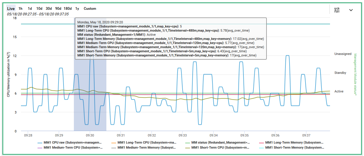
- You can view a tooltip to show the values at a given moment in time by hovering the cursor over a trendline. The tooltip also displays the date and time for the displayed sample.
Displaying a tooltip by hovering the cursor over a data point
- You can spotlight a single data line on the graph by hovering the cursor over the corresponding entry in the legend. The other lines will fade.
Spotlighting a single data line by hovering the cursor over the legend entry
Additionally, clicking on an entry in the legend will toggle between making that entry's name gray and causing its line to disappear from the graph, or making the monitor's name bold and causing its line to reappear on the graph.
- You can choose which monitored resources to display by clicking the Configure Chart button on the top right and opening the Customize Chart dialog window.
Configure Chart button on the top right of the graph
The default monitoring mode is Automatic Monitoring, in which certain meaningful monitors and resources are automatically selected to be displayed on the agent graph. To customize what resources (i.e. monitored values) are displayed on the graph, select the Customize Monitoring radio button.
Custom Monitoring page in which you can select which monitors and resources are visible on the graph
The graph shows data lines for up to eight metrics at a time.
The various columns in the table can be sorted and filtered.
The graph displays alerts for all metrics being monitored; however, the graph shows data lines for up to a maximum of eight metrics at a time. You can choose which metrics are shown on the graph: to display a metric in the graph, check its corresponding Show column box, and to remove a metric from the graph, uncheck its corresponding Show column box.
If a monitor is a wildcard type that monitors multiple metrics, clicking on its Show column box will open a dialog window in which you can choose which resources will be displayed on the graph.
The Resources Selected column shows how many resources are selected out of the total
resources being watched by that monitor.
If a monitor uses an aggregation function to condition raw data before displaying it, that function is displayed in the Aggregation column.
Zooming in on the graph
There are several different ways to focus in on a specific time period on the time-series graph.
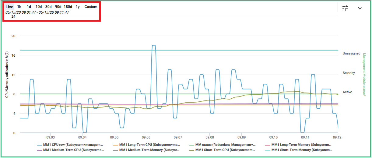
- You can zoom in and out on the graph by selecting a zoom level from the options displayed at the top left of the graph: 1 hour, 1 day, 10 days, 30 days, 90 days, 180 days, and 1 year. You can also select Custom to specify a date and time range.

Options on the top left to change the time period shown on the graph
- You can also choose a custom date and time range by highlighting a section of the graph as follows:
a. Hover the cursor over the graph so that a vertical line appears.
b. Click and drag the vertical line to the left or right to define the time period you want to view.
c. Release the mouse button to redraw the graph for the selected period.

Highlighting a slice of the graph to zoom in on that time period
In the custom view, the date and time range for the displayed graph is shown on the top left under the zoom level selection buttons.
To reset the graph, select the default Live zoom level.
Downloading the graph as an image or spreadsheet
You can download the graph either as an image or as a set of comma-separated values that can be opened in spreadsheet editors. The download options are accessed by clicking the down arrow in the top right of the time-series graph.
Clicking on the arrow to display download options
To download the graph as an image, click the down arrow and select Download Chart.
The graph is downloaded as .png image.
To download the graph as a set of comma-separated values, click the down arrow and select Export to CSV. The graph is downloaded as a .csv file.
Showing the available download options
Jumping to an alert on the graph
The graph may not show all triggered alerts, depending on what time period is currently being displayed. To change the graph to display an alert and its associated metric, ensure that you are on the Agent Details page, and then select the desired alert in the Alerts table and click Navigate.
Highlighting an alert to navigate to it, from the Agent Details page
The graph is changed to display a time period centered around the alert.
Graph updated to display a specific alert
It's possible that the metrics triggering the alert are being monitored but not currently being shown in the graph. The metrics that are being shown on the graph are listed in the legend at the bottom of the graph.
To adjust the graph display to show the metrics responsible for causing the alert, locate the alert on the graph and click its associated triangle symbol at the top of the graph. The Alert Details dialog box is displayed.
Alerts are represented by triangles at the top of the graph.
Alert Details dialog in which you can see, among other information, the monitors responsible for the alert
This dialog pane shows the monitor that triggered the alert; this information can then be used to customize the graph by following the steps detailed above.
Updated 11 months ago